Responsive Web Design Breakpoints with Bootstrap 5
Bootstrap 5 includes a responsive grid system that utilizes breakpoints to create responsive web designs. Breakpoints are specific screen widths at which the layout and appearance of a website or web application can change to adapt to different screen sizes, such as those of desktops, tablets, and smartphones.
In Bootstrap 5, there are six predefined breakpoints that are based on common device screen sizes, which are as follows:
- Extra Small (xs): This breakpoint is for screens with a maximum width of 575.98 pixels. It is typically used for smartphones and other small mobile devices.
- Small (sm): This breakpoint is for screens with a width of 576 pixels or larger. It is often used for small tablets and larger smartphones.
- Medium (md): This breakpoint is for screens with a width of 768 pixels or larger. It is commonly used for tablets and larger devices.
- Large (lg): This breakpoint is for screens with a width of 992 pixels or larger. It is often used for desktops and larger screens.
- Extra Large (xl): This breakpoint is for screens with a width of 1200 pixels or larger. It is commonly used for larger desktop screens.
- Extra Extra Large (xxl): This breakpoint is for screens with a width of 1400 pixels or larger. It is used for extra large screens.
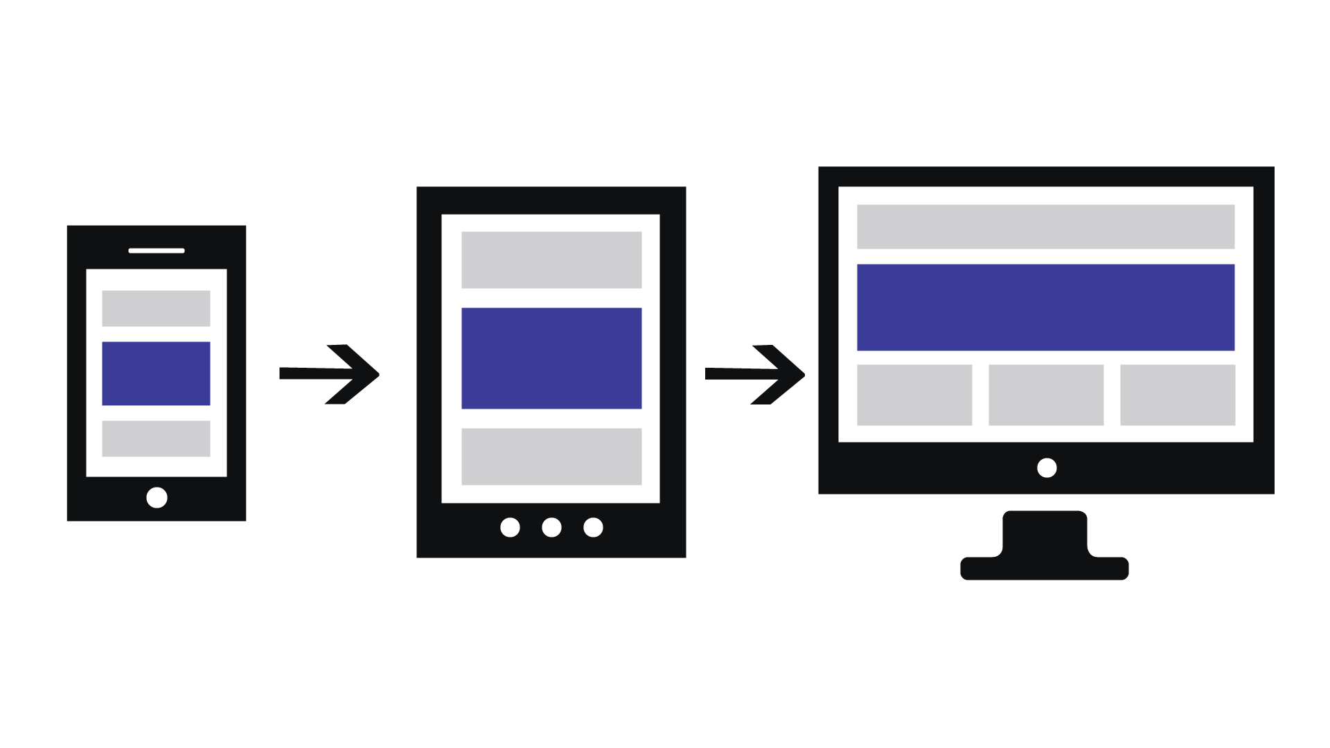
Bootstrap 5's responsive grid system allows developers to create different layouts and styles for each breakpoint, enabling the design to adapt to various screen sizes and providing a consistent and optimal user experience across different devices. By utilizing these breakpoints, developers can design responsive web interfaces that look good and function well on different devices, from small smartphones to large desktop screens.
Example
<!DOCTYPE html>
<html lang="en">
<head>
  <meta charset="UTF-8">
  <meta http-equiv="X-UA-Compatible" content="IE=edge">
  <meta name="viewport" content="width=device-width, initial-scale=1.0">
  <title>Document</title>
  <link rel="stylesheet" href="css/base.css">
</head>
<body>

</body>
</html>
css/base.css
body{
  margin-top: 70px;
}

body::before{
  content: 'XS';
  color:orangered;
  font-size: 30px;
  position: fixed;
  font-weight: bold;
  top: 10px;
  left: 10px;
}

@media (min-width: 576px){
  body::before{
    content: 'SM';
  }
}


@media (min-width: 768px){
  body::before{
    content: 'MD';
  }
}

@media (min-width: 992px){
  body::before{
    content: 'LG';
  }
}

@media (min-width: 1200px){
  body::before{
    content: 'XL';
  }
}
@media (min-width: 1400px){
  body::before{
    content: 'XXL';
  }
}
Live Preview
Bootstrap 5.3X Tutorial
Learn All in Tamil © Designed & Developed By Tutor Joes | Privacy Policy | Terms & Conditions