Building Responsive Web Layouts with Bootstrap 5: Harnessing the Power of Columns
In Bootstrap 5, columns are an essential part of the grid system that allows developers to create responsive and flexible layouts for web pages or applications. Columns are used to divide the width of a container into equal or varying parts, which can be used to arrange content in a structured manner. Here's an overview of columns in Bootstrap 5:
- Column Classes: Bootstrap 5 provides predefined classes, denoted by numbers ranging from col-1 to col-12, to define the width of columns. The number in the class name represents the number of columns a particular element should span. For example, col-6 would create a column that spans 6 out of the 12 columns, or 50% width.
- Responsive Design: Columns in Bootstrap 5 are designed to be responsive, meaning that they automatically adjust their width based on the screen size or device. This is achieved by using CSS media queries and predefined classes that specify the behavior of columns at different breakpoints. For example, you can use col-md-6 to specify that a column should span 6 columns on medium screens and above, and automatically adjust to a full-width column on smaller screens.
- Flexbox: Columns in Bootstrap 5 are built using the CSS Flexbox layout, which provides powerful and flexible options for creating responsive grids with less code and more control over the layout. Flexbox allows columns to automatically adjust their height to match the height of the tallest column in a row, which helps in aligning columns of varying heights.
- Content Alignment: Bootstrap 5 provides classes for aligning content within columns, such as text-center for centering text, align-self-start for aligning content to the top of the column, align-self-end for aligning content to the bottom of the column, and more. This allows for precise control over the alignment of content within columns.
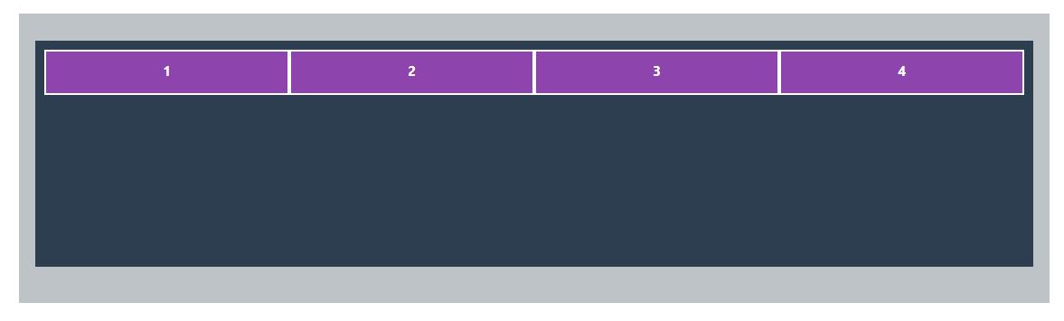
align-items-start
In Bootstrap 5, align-items-start is a CSS class used to vertically align content to the top of a column within a grid row. It is used in combination with the Flexbox layout classes to control the alignment of content within columns.
Here's an example of how to use align-items-start in Bootstrap 5:
 <div class="container">
      <div class="row align-items-start">
        <div class="col">1</div>
        <div class="col">2</div>
        <div class="col">3</div>
        <div class="col">4</div>
      </div>
 </div>
Outptut
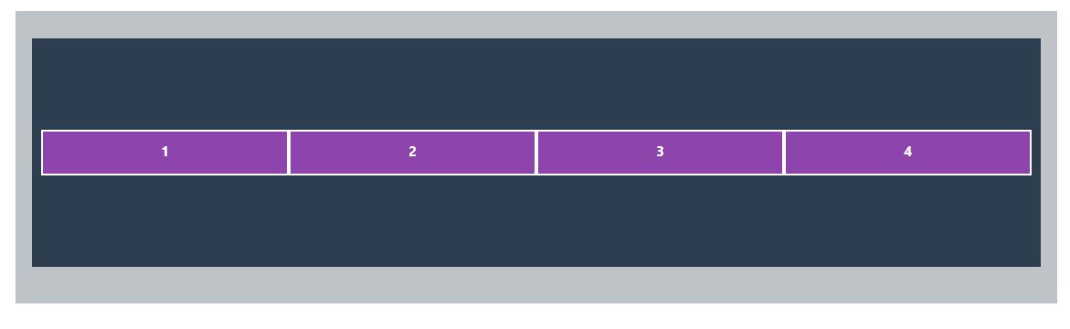
align-items-center
In Bootstrap 5, align-items-center is a CSS class used to vertically align content to the center of a column within a grid row. It is used in combination with the Flexbox layout classes to control the alignment of content within columns.
Here's an example of how to use align-items-center in Bootstrap 5:
 <div class="container">
      <div class="row align-items-center">
        <div class="col">1</div>
        <div class="col">2</div>
        <div class="col">3</div>
        <div class="col">4</div>
      </div>
 </div>
Outptut
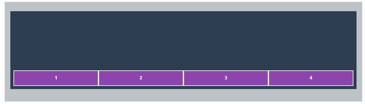
align-items-end
In Bootstrap 5, align-items-end is a CSS class used to vertically align content to the bottom of a column within a grid row. It is used in combination with the Flexbox layout classes to control the alignment of content within columns.
Here's an example of how to use align-items-end in Bootstrap 5:
 <div class="container">
      <div class="row align-items-center">
        <div class="col">1</div>
        <div class="col">2</div>
        <div class="col">3</div>
        <div class="col">4</div>
      </div>
 </div>
Outptut
align-self
In Bootstrap 5, align-self is a set of CSS classes that can be used to individually control the vertical alignment of content within a column in a grid row. These classes are used in combination with the Flexbox layout classes and provide more granular control over the alignment of individual columns.
The available align-self classes in Bootstrap 5 are:
- align-self-start: Aligns the content to the top of the column.
- align-self-center: Aligns the content to the center of the column vertically.
- align-self-end: Aligns the content to the bottom of the column.
- align-self-baseline: Aligns the content to the baseline of the column.
- align-self-stretch: Stretches the content to fill the height of the column.
justify-content
justify-content is a CSS property that is commonly used in conjunction with Bootstrap 5's flexbox utilities to control the alignment of flex items along the main axis (horizontal axis) of a flex container. In Bootstrap 5, the justify-content property can be applied using various classes to achieve different alignment options. Here's an explanation of some common justify-content classes in Bootstrap 5:
- justify-content-start: This class aligns the flex items to the start of the flex container, pushing them towards the beginning of the main axis.
- justify-content-end: This class aligns the flex items to the end of the flex container, pushing them towards the end of the main axis.
- justify-content-center: This class aligns the flex items to the center of the flex container along the main axis.
- justify-content-between: This class evenly distributes the flex items along the main axis, with the first item aligned to the start and the last item aligned to the end. This creates equal spacing between adjacent flex items.
- justify-content-around: This class evenly distributes the flex items along the main axis, with equal spacing around each item. This creates equal spacing between adjacent and outermost flex items.
- justify-content-evenly: This class evenly distributes the flex items along the main axis, with equal spacing between all flex items, including the outermost items.
These justify-content classes can be applied to the parent element of a flex container in Bootstrap 5, such as a div with the class d-flex, to control the alignment of its child flex items. By using these classes, you can easily create flexible and responsive layouts with aligned flex items using Bootstrap 5's flexbox utilities.
order
In Bootstrap 5, the order class is used to control the order of flex items within a flex container. It allows you to visually rearrange the order of elements displayed in a flexbox layout, without changing the actual HTML structure. The order class can be applied to individual flex items using numeric values to specify their display order.
Where {value} is a numeric value that determines the order of the flex item. A lower numeric value will position the flex item earlier in the order, and a higher numeric value will position it later in the order. The default value for order is 0 , so if no order class is applied, the flex item will have the default order of 0 .
The order class in Bootstrap 5 uses the following syntax:
<div class="order-{value}">
  <!-- Flex item content -->
</div>
Example
<!DOCTYPE html>
<html lang="en">
<head>
  <meta charset="UTF-8">
  <meta http-equiv="X-UA-Compatible" content="IE=edge">
  <meta name="viewport" content="width=device-width, initial-scale=1.0">
  <title>Document</title>
  <link href="https://cdn.jsdelivr.net/npm/bootstrap@5.2.2/dist/css/bootstrap.min.css" rel="stylesheet" integrity="sha384-Zenh87qX5JnK2Jl0vWa8Ck2rdkQ2Bzep5IDxbcnCeuOxjzrPF/et3URy9Bv1WTRi" crossorigin="anonymous">
  <link rel="stylesheet" href="css/base.css">
  <style>
  .container{
        background-color: #bdc3c7;
        padding: 30px;
      }
  .row{
        background-color: #2c3e50;
        padding: 10px;
        height: 250px;
        margin-bottom: 10px;
      }
    .col,
    .col-2
    {
        background-color: #8e44ad;
        height: 50px;
        padding: 10px;
        border:2px solid white;
        color:white;
        font-weight: bold;
        font-size: 15px;
        text-align: center;
    }
  </style>

</head>
<body>
  <!--Vertical alignment -->

  <div class="container">
    <!--
      <div class="row align-items-start">
        <div class="col">1</div>
        <div class="col">2</div>
        <div class="col">3</div>
        <div class="col">4</div>
      </div>
      <div class="row align-items-center">
        <div class="col">1</div>
        <div class="col">2</div>
        <div class="col">3</div>
        <div class="col">4</div>
      </div>
      <div class="row align-items-end">
        <div class="col">1</div>
        <div class="col">2</div>
        <div class="col">3</div>
        <div class="col">4</div>
      </div>

    <div class="row align-items-lg-end align-items-sm-center">
      <div class="col">1</div>
      <div class="col">2</div>
      <div class="col">3</div>
      <div class="col">4</div>

    </div>
     <div class="row">
      <div class="col align-self-start">1</div>
      <div class="col align-self-center">2</div>
      <div class="col align-self-end">3</div>
      <div class="col align-self-stretch">4</div>
    </div>
    <div class="row">
      <div class="col align-self-lg-center align-self-start">1</div>
      <div class="col align-self-lg-end align-self-start">2</div>
      <div class="col align-self-lg-start align-self-start">3</div>
      <div class="col align-self-lg-stretch align-self-start">4</div>
    </div>
      <div class="row justify-content-lg-center justify-content-between">
      <div class="col-2">1</div>
      <div class="col-2">2</div>
      <div class="col-2">3</div>
    </div>
  </div>
     -->
    <div class="row">
      <div class="col-2 order-lg-1 order-2">1</div>
      <div class="col-2 order-lg-2 order-3">2</div>
      <div class="col-2 order-lg-3 order-1">3</div>
    </div>
  </div>

  <script src="https://cdn.jsdelivr.net/npm/bootstrap@5.2.2/dist/js/bootstrap.bundle.min.js" integrity="sha384-OERcA2EqjJCMA+/3y+gxIOqMEjwtxJY7qPCqsdltbNJuaOe923+mo//f6V8Qbsw3" crossorigin="anonymous"></script>


</body>
</html>
Live Preview
Bootstrap 5.3X Tutorial
Learn All in Tamil © Designed & Developed By Tutor Joes | Privacy Policy | Terms & Conditions