Understanding Input Types in HTML5
In HTML5, the <input> element is used to create various types of form controls, such as text fields, checkboxes, radio buttons, and more. Here are some of the most common input types and their descriptions:
| text | password | radio | checkbox | submit | reset |
| hidden | file | image | color | date | datetime |
| datetime-local | month | number | range | search | |
| tel | time | url | week |
The following are some of the common attributes used in the text input type in HTML:
- name: the name of the field that is used to identify the data when the form is submitted.
- value: the initial value of the field.
- size: the width of the text field in characters.
- maxlength: the maximum number of characters that can be entered in the field.
- placeholder: a short hint that describes the expected value of the field.
- autocomplete: a Boolean attribute that indicates whether the field should have autocomplete functionality.
- required: a Boolean attribute that indicates whether the field is required to be filled in before submitting the form.
- readonly: a Boolean attribute that indicates whether the field is read-only and cannot be edited.
- disabled: a Boolean attribute that indicates whether the field is disabled and cannot be interacted with.
- pattern: a regular expression that the value of the field must match.
- title: a text description of the field that is displayed as a tooltip when the user hovers over the field.
text
A standard text field where the user can enter any text string.
<input type="text">password
A text field with masked characters, commonly used for entering passwords.
<input type="password">radio
A radio button that allows the user to select one option from a group of options.
<input type="radio">checkbox
A checkbox that allows the user to select multiple options.
<input type="checkbox">submit
A button that submits the form data to a specified URL or server-side script.
<input type="submit">reset
A button that resets the form data to its initial values.
<input type="reset">hidden
A field that is not visible to the user but is used to store data that can be used when the form is submitted.
<input type="hidden">file
A field that allows the user to select a file to be uploaded to the server.
<input type="file">image
An image button that allows the user to submit the form by clicking an image.
<input type="image">color
A field that allows the user to select a color.
<input type="color">date
A field that allows the user to select a date.
<input type="date">datetime-local
A field that allows the user to select a date and time.
<input type="datetime-local">A field that requires the user to enter an email address.
<input type="email">month
A field that allows the user to select a month.
<input type="month">number
A field that requires the user to enter a numerical value.
<input type="number">range
A slider control that allows the user to select a value within a range of values.
<input type="range">search
A text field for entering a search query.
<input type="search">tel
A field for entering a telephone number
<input type="tel">time
A field that allows the user to select a time.
<input type="time">url
A field that requires the user to enter a URL.
<input type="url">week
A field that allows the user to select a week.
<input type="week">Source Code
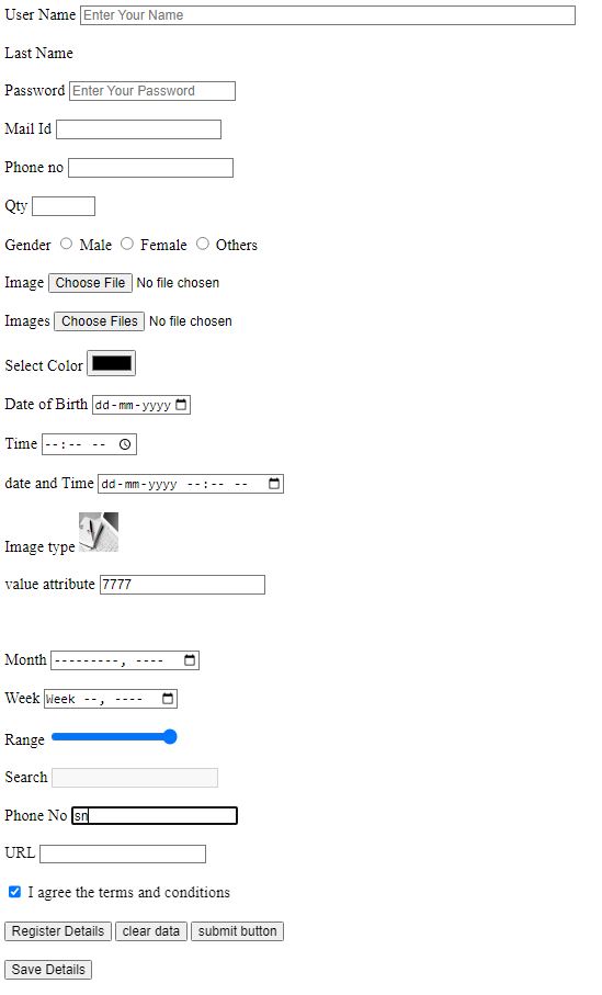
<!DOCTYPE html>
<html>
    <head>
        <title>FORMS - HTML</title>
    </head>
    <body>
        <form>
            <label> User Name</label>
            <input type="text" placeholder='Enter Your Name' required size="70">
            <br><br>
            <label> Last Name</label>
            <input type="hidden" placeholder='Enter Your Name' required size="70">
            <br><br>
            <label> Password</label>
            <input type="password" placeholder='Enter Your Password' required>
            <br><br>
            <label> Mail Id</label>
            <input type="email" >
            <br><br>
            <label> Phone no</label>
            <input type="text" maxlength='12' name="pno" required>
            <br><br>
            <label> Qty</label>
            <input type="number" min='0' max='10' step="7" required>
            <br><br>
            <label> Gender</label>
            <input type="radio" name="a"> Male
            <input type="radio" name="a"> Female
            <input type="radio" name="a"> Others
            <br><br>
            <label>Image</label>
            <input type="file" ><br><br>
            <label>Images</label>
            <input type="file" multiple><br><br>
            <label>Select Color</label>
            <input type="color" ><br><br>
            <label>Date of Birth</label>
            <input type="date" min="2018-01-24" max="2025-12-15"><br><br>
            <label>Time</label>
            <input type="time" ><br><br>
            <label>date and Time</label>
            <input type="datetime-local" ><br><br>
            <label>Image type</label>
            <input type="image" src="tj.jpg" width="40" height="40" ><br><br>
            <label>value attribute</label>
            <input type="text" value="7777"><br><br>
            <input type="hidden" value="324234325"><br><br>
            <label>Month</label>
            <input type="month" ><br><br>
            <label>Week</label>
            <input type="week" ><br><br>
            <label>Range</label>
            <input type="range" value="89" min="0" max="78"><br><br>
            <label>Search</label>
            <input type="search" disabled><br><br>
            <label>Phone No</label>
            <input type="tel" pattern="[0-9]{2}-[0-9]{3}-[0-9]{3}-[0-9]{2}" autofocus><br><br>
            <label>URL</label>
            <input type="url" ><br><br>
            <input type="checkbox" checked> I agree the terms and conditions<br><br>
            <input type="submit" value='Register Details'>
            <input type="reset" value='clear data'>
            <button type="submit"> submit button</button>
            <br><br><button type="button"> Save Details</button>
        </form>
    </body>
</html>
Output :
 <form> tag
It is used to create an HTML form for user input.
<label> tagIt defines a label for an input element.
<input> tagIt is used to create various input controls, such as text fields, password fields, radio buttons, checkboxes, etc. In this code, various input types are used, such as text, hidden, password, email, number, radio, file, color, date, time, datetime-local, image, month, week, range, search, tel, url, and checkbox.
placeholder attributeIt is used to display a short hint in the input field, which disappears when the field gets focus.
required attributeIt is used to specify that an input field must be filled out before submitting the form.
size attributeIt is used to specify the size of the input field.
maxlength attributeIt is used to specify the maximum number of characters that can be entered into an input field.
name attributeIt is used to specify a name for the input control, which is used when submitting the form data.
min and max attributesIt is used with the number and range input types to specify the minimum and maximum values.
step attributeIt is used with the number input type to specify the legal number intervals.
value attributeIt is used to specify the initial value of an input control.
src attributeIt is used with the image input type to specify the source URL of the image to be displayed.
width and height attributesIt is used to specify the width and height of an image.
pattern attributeIt is used to specify a regular expression pattern that the input value must match.
autofocus attributeIt is used to specify that an input control should automatically get focus when the page loads.
disabled attributeIt is used to specify that an input control should be disabled and not be editable by the user.
checked attributeIt is used to specify that a checkbox or radio button should be pre-selected.
HTML5 Tutorial
Learn All in Tamil © Designed & Developed By Tutor Joes | Privacy Policy | Terms & Conditions